RunRagged wrote: Thanks. But Katie Moon isn't wearing the same item in those photos. At all. Her post says as much: "I tried on the same style today."
Her claim that she "tried on the same style" is pretty ridiculous too. Coz Moon is clearly wearing two different two-piece ensembles where the tops and bottoms are "separates" independent of, and detached from, one another.
The one photo is literally captioned ‘The onesie’ is clearly one piece, there’s just a black line in the fabric. You’re letting bias influence what you see.
And if runragged had bothered to look at the mannequin picture, they’d see it also has the same line in the fabric, just in red/pink.
Regardless of the cut, they are still hideous. The red and blue blend together and they just look like a weird purple.
That's the main problem. They totally ignored the white instead of making use of it. Everybody is focusing on the high cut women's uniform right now. By Paris that will change. They crammed too much red and too much blue together in ugly overboard fashion, especially with the men's uniforms.
Canada's versions were released yesterday to high praise. I'm sure the timing was not coincidental. Lululemon saw the backlash against the United States versions and wanted immediate contrast to their own:
There is a lot of Olympic talk because it is 100 days out. Lululemon seems to be Canada’s supplier for ceremonies (opening, closing, medals) but not competition. Nike is Canada’s supplier for track and field.
Goodness gracious people. It's the mannequin that's made wrong. No athlete has that big ponch and hoo ha hitting the tape first. End of story. Move on.
Wow, the PR machine is in motion. You don't think this is all carefully crafted? You don't think they found people to give the talking points for this article? Just because you have "options" doesn't mean that one of the options is a really bad look. There really isn't a need to defend it like that. Just say that that one option is not great & move on.
Goodness gracious people. It's the mannequin that's made wrong. No athlete has that big ponch and hoo ha hitting the tape first. End of story. Move on.
Well, then Nike uses exaggerated mannequin in the promotion pictures, which is sexualization of female body, and it should be strongly condemned by the feminists. Nike should just use a regular fat person on street as their model so Americans can be well represented. Nobody could be offended.
Wow, the PR machine is in motion. You don't think this is all carefully crafted? You don't think they found people to give the talking points for this article? Just because you have "options" doesn't mean that one of the options is a really bad look. There really isn't a need to defend it like that. Just say that that one option is not great & move on.
Of course, I'm also not sure that Nike didn't purposely release the hoo-ha picture under the classic thinking that "all publicity is good publicity," knowing full well that runners like Fleshman would take the bait and spread the photo for them. Free marketing.
somebody got to these athletes. their getting heat from somebody. anybody with even a smidge of taste can possible thing these uni's are not butt ugly. and with the font? it looks like it was designed using an etch a sketch.
Goodness gracious people. It's the mannequin that's made wrong. No athlete has that big ponch and hoo ha hitting the tape first. End of story. Move on.
Well, then Nike uses exaggerated mannequin in the promotion pictures, which is sexualization of female body, and it should be strongly condemned by the feminists. Nike should just use a regular fat person on street as their model so Americans can be well represented. Nobody could be offended.
The mannequins are exaggerated black too and I think it's also the dumb-a$$ backlighting , but are the necks sexualization of women also? Freeking weird. The uniforms are butt ugly for sure--that's normal Nike. They try so hard to be cutting edge-- its embarrassing
cant wait to see the Ceremony clothes, -500 odds they'll be gaye
I haven't seen yet anyone explain how the patriarchy likes to spend so much time designing women's clothes. As much as men like women and admiring women we (most maybe not all but most) just aren't all that interested in designing women's fashions.
many of the most iconic designers of women's fashion are gay men.
Is it many or some? Not sure how the stats add up there, but I don't think gay men are in category of the patriarchy or objectifying women.
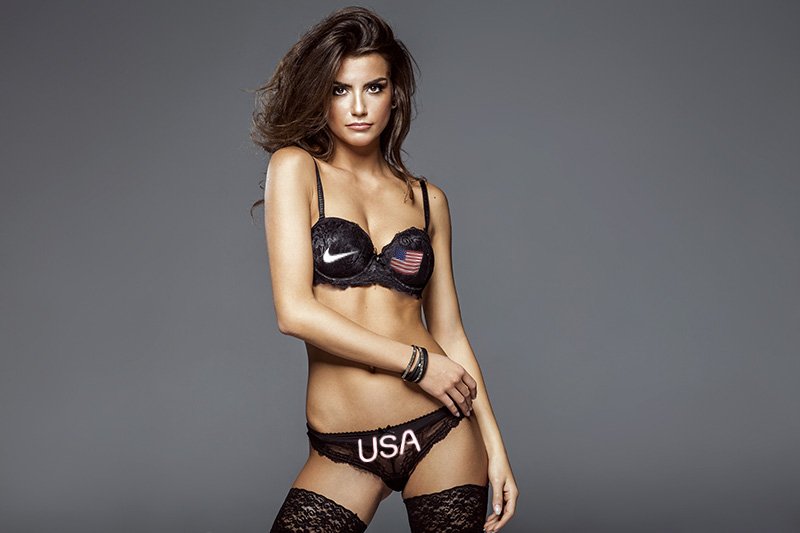
This is supposed to be funny, but there’s really not that much difference in exposed skin area between lingerie and what some runners wear. Sports bras cover a bit more than just a bra but the fishnet stockings more than compensate making it more modest overall going by exposure.
I am with the ladies. If they are good with the uniforms, I am good with them. The design is not that much different than what swimmers have worn for years. I am pretty sure the team gets multiple uniforms anyway, some with fuller cuts. If anything the controversy got people talking about track, and that’s a good thing.
She claims it's just fine, but look at her photo and the photos from the release. Was it all "just the mannequin"? The bottoms don't look the same. The wedge angle on the released photos is definitely higher.
The difference seems pretty clear here. As much as Rojo protests, this seems to be much ado about something.
I am with the ladies. If they are good with the uniforms, I am good with them. The design is not that much different than what swimmers have worn for years. I am pretty sure the team gets multiple uniforms anyway, some with fuller cuts. If anything the controversy got people talking about track, and that’s a good thing.
This is the boring yet correct take. Not to mention they have a choice.